
I’m probably going to regret this post but I’ve seen a number of women’s magazine websites launched recently with some pretty fundamental errors worth commenting on. When I originally wrote this post I didn’t intend to single out Glamour, but as I uncovered more and more ‘challenges’ the post took on a life of its own. In no way is this a criticism of the editorial on this website, but I think the issues below do highlight a fundamental disconnect between design and content.
But before we commence let’s expose a couple of fallacies…
The Big Image Fallacy
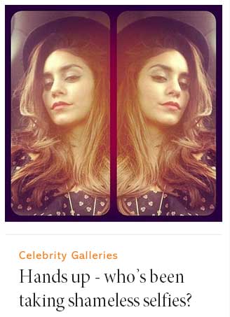
There seems to be a rumour circulating that the only way to keep (female) readers on your site is to hit them with BIG IMAGES ON EVERY PAGE. I’m not sure if this is a result of publishers wanting to imitate the success of MailOnline but it can produce some pretty shocking results. Of course, big images are popular on fashion and celebrity sites because, in most cases, the photo is often the story and readers like to see portrait images detailing what their favourite celebrities wore. However, this can never be at the expense of basic navigation and user journey flow.
The Simplicity Fallacy
The decision to make your website less cluttered and ‘noisy’ is to be admired. However, this can be at the expense of some pretty simple signposts that aid the reader. We need to strip back, present clear value and answer these user questions: ‘Why am I here? What’s in it for me? How can you make my life better?’ Also, if you’re going strip away (and here come the caps for extra effect with ** to indicate use of obligatory klaxon) *MAKE SURE YOU ACCOMMODATE ADVERTISING!*
And so, here are my content strategy recommendations for the site in question….
Glamourmagazine.co.uk
The first question I always ask when I arrive at a website is ‘Why am I here?’ A strong design with adequate spacing for the text to breathe and well-constructed headers, will normally answer this question and orientate the reader across the page. If that isn’t apparent then we fall into all kinds of problems.
1. The logo completely dominates the space above the fold. As a result the 728px x 90px banner beneath takes centre stage (at least on a large monitors). Great for advertisers, not so great for readers.
2. Although it’s great to see a call to action to purchase the magazine immediately under the navigation, it’s another reason why the content (surely the best reason to buy the magazine in the first place) is pushed further down the page.
3. The main navigation appears immediately below the logo and, with its central alignment, could be confused as strapline text. Logo and navigation should always be clearly distinguished.
4. As a result we uncover an issue with what appears to be the ‘quick link’ secondary navigation at the top of the site. Although this is a common feature across sites today, here it is deployed at the expense of the main navigation. Simply put – when I hit this page I don’t feel reassured by strong IA.
![]()
5. As for the content on the page, without any clear headers clearly labelling each of the features, we have no way of guiding and exciting the reader down the page. Firstly, we are presented with ‘Dos and Don’ts’ but I don’t really know what that is (also, isn’t that an idea ripped from Vice?). Then the way the content has been displayed modular box format seems to lack any logic or prioritization. As a user I am not being told why I should click onto any of these features. What’s hot right now? What’s trending? If you want me to spend more time on your site then don’t make me think, just present it on a plate.
6. …I see some way of addressing this with the use of orange text above the headline for each feature. But why would you do this? This is a misuse of a tagging surely – I should be able to click on, say, ‘Celebrity Fashion’ and see all articles tagged like this?
7. I also see the images on the site ‘Do’s and Don’ts’ quickly resize themselves on page load. Buggy. I also see a slight delay on page loads with some odd repercussions for the modules on the page. Shame, as it really spoils the modular layout they have chosen.
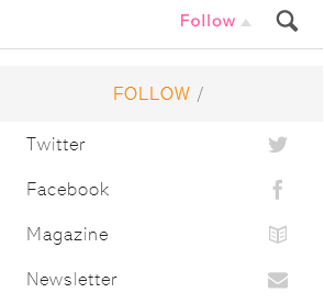
8. Although social media integration is apparent, I’m not a fan of concealing icons under drop downs. You could have made it easier for the user to see and respond. Again, don’t make me think.
9. It’s also obvious that this company does not produce content over the weekend as the screenshot of the homepage was taken at 10am this Monday morning. For a major brand like Glamour I am surprised. One way of masking this would be to remove the timestamps on the homepage. PS I really love the alignment of news on the left.
10. I also have an issue with the use of fonts. I’m not a font specialist (my dad was, 20 years as a compositor don’t you know) but that choice of Abadi becomes tricky as the text size fluctuates without consistency across the page. I see a trend on fashion sites to use more ornate fonts and maybe the use of this font came from brand guidelines, but sometimes simple fonts like Arial should suffice without losing elegance.
11. As you might expect, all of the issues above are amplified on tablet. Remember, optimising for tablets is not just about delivering big images. Ironically, the mobile version of the site is perfectly fine. Perhaps, Glamour should have led with a mobile first strategy.

12. Navigation
I’ve already commented on the navigation issues but it’s worth commenting further. When you scroll down the page a ‘Sections’ tab appears in the secondary navigation. I wonder if this is enough to entice the user to explore their various, well, sections. I’m certainly not a fan of this kind of progressive disclosure on a desktop page, even though I think it works well on mobile.

Also, have you worked out what that star icon does? It flashes pink when I click on it, besides that nothing. Might only appeal to the ‘I <heart> pink flashing star icons’ gang?
13. Search results
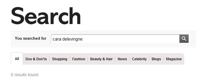
A quick search for ‘cara delevinge’ (that’s how you spell her name right?) produced no results. That could have been addressed. Still, let’s do a search using correct spelling and opps…tagging issue?
In Summary
Ten years ago we used to forgive magazine publishers for dipping their toes into digital and getting some things wrong. We accepted their expertise was in print and they had limited resource dedicated to digital. Now, it’s unacceptable and more than a little bit embarrassing.
Of course, there will always be teething problems on any site relaunch, but some of these issues could have been solved at the pre-production stage. The editorial is always of a high standard at Glamour UK but I hope the issues above highlight the tensions you sometimes get between design and execution.
I’m sure many of the issues above have already been spotted by their hard-working team and will be addressed very soon!
Have you any thoughts on the content strategy recommendations? Please feel free to leave your comments below.
Steven Wilson-Beales
Latest posts by Steven Wilson-Beales (see all)
- WANTED: Senior Editor - February 23, 2024
- My interview with Media Masters podcast - October 9, 2022
- An update from the digital wilderness. Also – synthesizers. - October 3, 2022