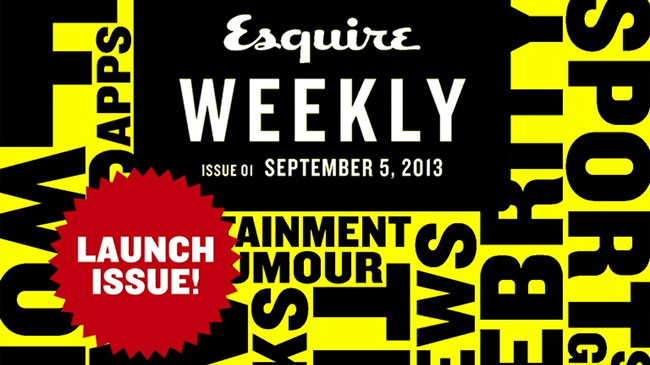
Always great to see a publication like Esquire enter the mobile domain, especially in the form of weekly updates. Magazine subscriptions are heading south so it’s refreshing to see this new emphasis to acquire new audience. It’s bonkers that some magazine publishers still only offer monthly editions on apps – how can they get true traction from that?
You know the drill. Here’s a list of content strategy recommendations would implement if I ruled the world:
- The opening animated graphic is very annoying after you’ve experienced it once. No need to reactivate the animation once the user has seen it once.
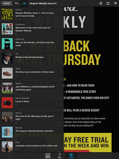
- An initial help screen that appears as soon as the app loads first time (like the Guardian or Mail iPad edition) would have helped. Otherwise, the user is left to second guess the journey they want to take – until you click on the hidden navigation of course.
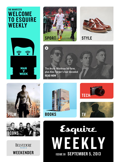
- The first content page is certainly pleasant enough – but would have been improved by displaying the text across the image. Instead, the current set-up forces you to double-click to get to the content which takes away from the otherwise smooth experience.
- On any new launch I always look to the Editor’s letter to explain the proposition and what we can expect in the future. After reading this article I wonder if it’s just enough to talk about being the place to go for all your top recommendations. This sounds like the basis for any editorial proposition, not a rallying call to a whole new experience. I’m not exactly sure why I should keep coming back for more.
- I like the ‘What we’re talking about’ modules – touch one and you’ll get a short 150 words on whatever is hot at the moment. I think Esquire could make more out of this to support the proposition further.
- Although the app preserves an Esquire navigation bar at the top of the screen when viewing content on other sites, the experience is a little confusing. This navigation bar needs to preserve some stronger Esquire branding to reassure the user they are still within the app experience.
- It’s a shame I can’t share Esquire content on the iPad across social media.
- For a launch edition I’d like to see an easy way for users to offer feedback. Analysing user journeys will help but there’s nothing like reviewing actual user comments.
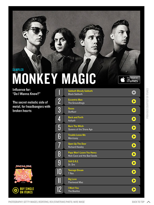
- Small point. There is a nice playlist on the Arctic Monkeys article. I would have liked to have seen a bit of editorial explaining the story behind each selection. I might sound picky, but it’s details like these that will separate you from the competition.
- Sometimes when I scroll sideways between the features I arrive halfway through the next
feature – again adds to the disorientation of the navigation.
Summary
Great to see Esquire in the new format. However, like their website, I’d really like to see improvements to navigation and a stronger understanding of why I should devote my time to Esquire rather than any other brand. As acknowledged by the Editors, we live in very busy times, so give me something ‘easy to get’ and I’ll be a loyal subscriber.
Have you any thoughts on the content strategy recommendations above? Please feel free to leave your comments below.
Steven Wilson-Beales
Latest posts by Steven Wilson-Beales (see all)
- WANTED: Senior Editor - February 23, 2024
- My interview with Media Masters podcast - October 9, 2022
- An update from the digital wilderness. Also – synthesizers. - October 3, 2022